Young Adult Income and Debt Trends since 1989

Most Americans say that their children will be financially worse off than they were at the same age. I decided to investigate if the trends over the past 25 years show a downward trend for today’s Millennials just now starting to 20’s and 30’s.

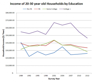
Since most of us aren’t independently wealthy enough to not work, income is the major factor behind most people’s financial health.  For households who’s heads are are between the ages of 20-30 years old, inflation adjusted incomes have been  trending slightly down since 1989.  Since the data is grouped by the age of the head of a household,  most full-time students will not be represented in this age bracket.  So the trends should only include financially independent 20-30 year olds who have left their parents households.   In the graph you can see that the educational income premium for 20-30 years is very significant.  Fluctuating at a roughly 40% increase for college graduates over high school graduates.

20s income over time

The inflation adjusted incomes of the older millenial and the younger Gen-Xers (represented in the 30-40s age groups in the 2013 data)  also follow a similar trend of staying relatively stable since 1989.  College graduates have seen a slight over-all increase but not much.  So it looks like at least looking at just income, Millenials and young Gen-Xers are doing roughly the same as the the previous generations in terms of income.30s income over time

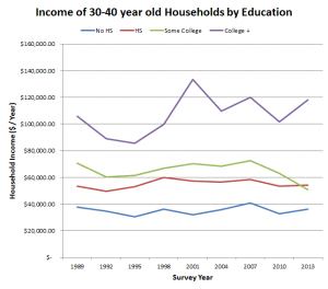
So far, we’ve seen that things are not bad for college graduates, not great but at least for the most part today’s Millennials are starting off at roughly the same incomes as the previous generations.  The other educational income groups aren’t doing quite as well as college graduates, but their overall trends are not quite as terrible as headlines would suggest.

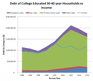
 Income isn’t the only measure of financial health though.  Debt is another important factor and as the graphs show, debt is increasing significantly for college graduates. Debt from housing (such as mortgages) has been the category with the largest dollar value increase over the past 2 decades.  There was a spike in debt leading up to the great recession that appears to have followed the 30-40 year old households as they have aged. For the 20-30s bracket is seems as though enthusasim over home ownership has reverted back to the historical levels of debt despite the current low interest rates.  Car loans have also been largely stable and are almost unchanged, since 1989.  The biggest consistent percent increase has been in student loans which comprise roughly a third of 20-30 year old debts and about a tenth of 30-40 year old debts in 2013.debt college educated 20s vs income debt college educated 30s vs income

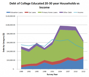
OOverall from these selected figures, younger Millennials are not doing worse than previous generations, but older Millennials are carrying far greater loads of debt that any comparable age group before.

These figures are results off of the Survey of Consumer Finances conducted by the US Federal Reserve.  All figures are stated in 2013 inflation adjusted dollars.

Tips to finding the best way to travel home for the holidays

Ever since I graduated college, I’ve lived in states far away from my parents.  So, if I wanted to go home for the holidays, I had to make a plan so that I could still meet expectations at work, and avoid breaking the bank. Here are a few of the tips that I’ve learned along the way.

Tip 1: Use Google Flights

My favorite flight comparison website is Google Flights.   Not only do they do a good job at showing the lowest prices for that ticket, it’s also really easy to figure out the cheapest times/days for your flights that would work in your schedule.  The only downside is that Southwest flights aren’t part of the search.

One of the best features are their calendar views.  If you click where the yellow cursor is (right in one of the date selection boxes) another set of options will pop up.
google flights 1

You’ll first see the calendar view, which shows you the cheapest days to depart if you were to shift the start of your vacation to that date.  So if you initially searched for a departure and return flight that were a week apart, the calendar will show you the best prices for departures and returns a week apart.

google flights2

The next view is the price graph which gives you a nice representation for how the prices are trending.  I use this to figure out the absolute lowest price the flight goes for before deciding if I’m going to wait and chance it or buy a ticket now.

google flights3

In general, prices are pretty erratic 2-6 months out, so if you check the prices pretty frequently, you might get a deal.   Once you wait till 1 month or less, the prices are pretty stable but trend up the longer you wait.

Tip 2: Book a Refundable Southwest Ticket and then check Google  Flights every single day.

The standard Wanna-Get-Away Southwest ticket is refundable for an equal flight credit which will expire. So if you want to lock in a ticket just in case the flight prices skyrocket, you can book a flight with Southwest and keep checking Google Flights to see if something better pops up.  You should really only do this, if you’ll fly enough to use the credit before it expires.  It’s way better if you use Southwest reward miles instead of money,  since those are 100% refundable.  So if you cancel your flight you won’t incur any penalties or limitations.

Tip 3: Try the Bus or Train

If you don’t like driving long distances, buses and trains are an option.  I personally would not do this if it involves a transfer or is longer than 8 hours.  The buses that I have ridden have had wifi, built in outlets, and comfy seats so it’s about as comfortable as flying.  Amtrak has way more comfortable seats than most airlines, but most of their trains lack wifi or outlets.

Tip 4: Get Airline Points

If you’re planning 6 months ahead, you could try to get an airline rewards credit card.  Many airline credit cards have sign on bonuses of 40,000 – 50,000 points for meeting a minimum spend of a few thousand dollars within the first few months of getting the card.  It takes time for you to receive the points, so you have to start the process early enough in the year so that you can use them for holiday travel.  I would check out the subreddit /r/churning for more information on which cards are the best.

Good luck, and happy holidays! If worst comes to worst, you can always rent a car.


The Change in Median American Net Worth from 1989 to 2013

Now that I’ve updated all the tools to reflect 2013 SCF data, I decided to create a much larger database from the SCF using data all the way back to 1989. There’s more to come on that, as I am still working on the best way to let you guys play with the data, but just to show you what’s to come.  Like the tools that are currently available, this data was calculated using the Federal Reserve’s Survey of Consumer Finances.  I took the net worth statistics for each year and calculated what it would take to rank at certain percentiles of wealth.

Here is a table showing the net worth by percentile for every SCF since 1989. The Fed has already converted all the dollar values in the most recent versions of the data to 2013 dollars (using standard inflation rates), so we’re comparing apples to apples. As you can see across the board, from 2004 to 2007, net worth peaked across the distribution. Networth The disturbing thing though, is that since then only the 90% and above has had a nearly full recovery in wealth. The 25% and below are hitting historic lows in wealth, and the median wealth of Americans is lower than 1989, despite the massive increase in GDP, productivity, and total wealth in the United States. It appears that the majority of those gains have been concentrated in the top 10% of Americans rather than being evenly distributed.

Capture
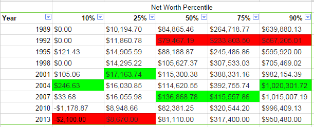
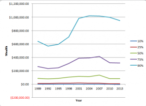
For further reference here are those same numbers plotted to show the relative changes in wealth between Americans at the 10th, 25th, 50th, 75, and 90th percentiles. The largest gains in the last couple decades have captured at the 10% and presumably above.  I am hesitant to calculate and publish the numbers of the 5th and 95th percentiles because the data is a lot more prone to being skewed at the long tail ends of the distributions.

Survey of Consumer Finances 2013 Results have been released!

Several visitors have notified me the release of the Survey of Consumer Finances (SCF) 2013 data.  In the 3 years between the previous survey in 2010, the economy has improved, unemployment is down, and the stock market has soared.  All of these factors have suggested that American’s finances (adjusted for inflation) would have improved since then.  I’m working on updating them to the new data set over the next month.

The first few publications from the Federal Reserve have shown that this is not the case, and in fact, median net worth and income is down since 2010.  This is on top of the drop from 2007 to 2010.  Mean income and net worth on the other hand have increased since 2010, which is an indicator of an increasingly unequal distribution of wealth.

income_scf_2013networth_scf_2013


A couple other highlights:

  • Mean Net Worth Increased only in the lowest 25% and the top 10%.
  • Mean & Medium income increased only for the top 20%.
  • Overall US Household debt has decreased– this may have been affected by the drop in home ownership.
  • The importance of college degrees continues to grow as college degree holders showed 1% inflation adjusted growth in median income over the past 3 years compared to drops in median income for less educated people (-6% to -11%).

See the whole article here: http://www.federalreserve.gov/pubs/bulletin/2014/pdf/scf14.pdf

Note the numbers might not line up exactly with the numbers on the calculators here due to inflation adjustments and some differences in the weightings used–the Federal Reserve doesn’t publish the exact weightings that they use for publications but they publish one set that is fairly close.

American Retirement Savings

Bankrate recently made headlines about American retirement savings.  According to Bankrate’s August 2014 Financial Security Index, 36% of all Americans have not started to save for retirement. This is much lower than the almost 50% of Americans surveyed in the Survey of Consumer Finances in 2010 who reported $0 in retirement savings.

This is the question and the survey results:

Screenshot 2014-08-19 at 1.45.49 PM

The question doesn’t ask about how much people have saved, just if they have started to save.  So I decided to compare these results to the results from the 2010 Survey of Consumer Finances from the Federal Reserve, where there is a survey question that asks how much the household being surveyed has saved for retirement, which includes IRA’s, 401k, Pensions,Thrift Savings, etc.

According to the SCF, 49.59% of the Americans they surveyed in 2010 did not have retirement savings.  So there appears to be a disconnect between people starting to safe for retirement and actually being able to accrue positive balances on their accounts.  4 years have past between the SCF survey and Bankrate’s 2014 survey, but recent news sources have shown declines in median networth during recent years.  Almost 64% of Americans have started to save but only 40% have retirement account balances above $10000.

This situation highlights one of problems with saving retirement, stability.  Half the battle is beginning to save, and the other half is being able to save enough to make a difference.