American 30 year old’s wealth also halved in the past decade

The BBC recently reported that Wealth of people in their 30s has ‘halved in a decade’ in the UK.

I ran the numbers for the United States using data from the US Federal Reserve and the results are shockingly similar. Using data from the most recent report from the Federal Reserve, people in their 30s have had a dramatic drop in net worth from $57000 prior to the recession to about $25000 in the years after the recession.  That is drop of over 55%! Even if you compare against numbers from 20 years ago, the wealth of people in their 30s today is half. Among the reasons for this are increased costs of education, reduced earnings, and higher health care costs.

Here is a graph showing the inflation adjusted median net worth trends of households led by 30 year olds every 3 years from 1992 to 2013 (the most recent survey available). All values are in inflation adjusted 2013 dollars.

Tips! Hover over the bars to see the exact amounts.

These trends are telling since this means that the younger generations are not able to build up the same levels of wealth as those who came before them.  With the upcoming election, it is not surprising that the younger generations have been attracted to relative political outsiders such as Bernie Sanders, Gary Johnson and Jill Stein who promise greater opportunities to those who have not seen much of the benefit of the recovering economy.

Looking at the median income for these households, income for these same households has dropped 13%+, since the recession and has not yet recovered. It is not as dramatic as the drop in net worth, but that 13% drop has basically handicapped many young adult households from being able to save.

The data for these charts came from the US Treasury. All of this data is freely available there for you to perform your own analysis and fact checking.

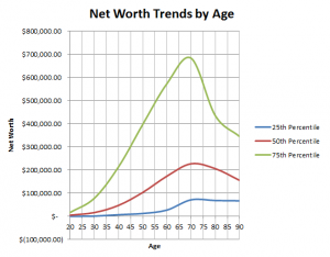
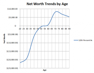
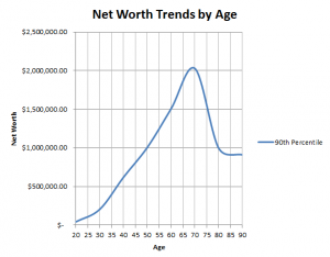
If you would like to play around with the 2013 net worth data, check out the net worth rank calculator. Net worth is defined at total assets minus total debts, including housing, vehicles, cash, investments and retirement accounts.

Who are the 1% by Income? [USA]

TL;DR The households of the 1% by income compared to the normal US households are White, college educated, professionals, work in services and are older.

If you want to become one of this very wealthy group in the future, go to college, get married and become a working professional. Here are some mobile-friendly charts and visualizations to explore the demographics and composition of who makes up the highest income earners in the US are and what they did to get there. Calculate if you are in the 1 percent by income.

Tip! You can hover or click on the graphs for more detailed information.

The households of the 1% have a median income over 22 times as high as median for all US households. This is a tremendously large advantage to these wealthy families to build their net worth.

Looking at their net worth, they are even wealthier at 93 times as much wealth than the median US household. It seems as though the highest income earners are able to save and build a disproportionately large amount of money compared average Americans.

Demographics

Generally, 1%er households are older, with almost none younger than 35 years old.

Compared to overall US population, the head of households of the 1% tend to be much more highly educated. Almost all of the highest income earners in the country have college degrees.

The 1% is overwhelmingly employed in white collared professions. Here’s an explanation in more detail of which jobs fit in which category:

  • White Collar: This category is generally what you would think of as college-educated professionals and managers. Typically these jobs are salaried and based in office environments. It includes jobs such as CEO’s, managers, analysts, computer professionals, scientists, researchers, lawyers, entertainers, educators, doctors, nurses, and other skilled health professionals.
  • Grey Collar: This category is includes technical, sales, and service jobs. Typically, these are hourly jobs that require some formal training, apprenticeships, or specialization. These jobs include front-line supervisors of grey and blue collared employees, clerks, sales people, administrators, agents, food prep, technicians, and operators.
  • Blue Collar: These are hourly workers who are typically not college educated. These jobs typically do not require much as formal training, but it does include many skilled professionals who work in manufacturing settings. This includes production, craft, repair, operational and general laborers. It also includes miscellaneous workers.
  • Not Working: These workers are not employed.

The families of the 1% also tend to be much more likely to be married. Stress over money is one of the major contributors to divorce, so their wealth may help stabilize marriages.

The 1% have a higher percentage of white people than the households of the overall US population. The non-white category includes Hispanics.

The 1% primarily work in non-production based industries. Services & Other includes high income industries such as finance, insurance and real estate (FIRE). Here’s an explanation of the groupings:

  • Production: These are industries that are involved in mining, manufacturing, and construction.
  • Services & Other: These group is basically everything else including transportation, communications, utilities, retail, government, finance, insurance, real estate, etc
  • Not Working: These head of households are not working.

one-percent
Note: The data used to generate these graphs are freely available from the Federal Reserve SCF. There is a known tendency for the SCF to over-sample the ultra-wealthy, such as the 1%, which causes the numbers from the SCF to have higher income and net worth of the 1% compared to other surveys. Use this data for generalizations on the 1%, but keep in mind all sampling of this group are hard due to low response rates.

What is your personal cost of capital?

Most large companies use a concept called the cost of capital as a factor judge whether or not an investment is worthy to go ahead. This cost of capital refers to the cost of taking on debt to pay for the investment or to the loss of what that money could have done elsewhere.

How does a personal cost of capital translate to my own personal finances?

Using a cost of capital in your personal life can help you to prioritize between paying off loans or investing in yourself, your business, or investments. First, the main concept is that your personal cost of capital should be low risk. Next, your personal cost of capital should have the largest expected payback of your low risk options. It will serve as the bar that any other financial decision needs to meet in order for you to go ahead.

For most people your personal cost of capital will first be:

  1. The interest rates on any debt that you hold (car loans, credit cards, student loans, mortgages, etc).
  2. If you don’t have debt, it would be the interest rate on any CD’s or savings accounts.

Everyone’s cost of capital will be different due to varying options and opportunities.  It will also change over time as you progress through life.

Example with Student Loans

Let’s say you went to college and have student loans.  You’re getting a $1,000 bonus at work. Further, you already have 6 months of savings in your emergency fund. You aren’t sure which of these options you should take:

  • Option 1: Leaving it in your bank account for 1% annual interest.
  • Option 2: Paying an extra $1,000 to your $10,000 student loans. These loans are at 6.8% annual interest and have 10 years remaining.
  • Option 3: Paying to take a certification which will earn you a $100 raise at work every year for the next 10 years. This equates to a non-compounding 10% interest rate.

Basic Analysis

  • Option 1 will net you $105 over 10 years and is very safe, using the interest formula, [Ending amount] = [Starting Amount] eAnnual Interest Rate * Number of Years
  • Option 2 will net you a guaranteed $875  over 10 years. This was calculated by summing up $3,809 in interest without the extra payment, versus $2,934 with the extra payment. I used this student loan payback calculator from Bankrate.
  • Option 3 may net you $1,000 over 10 years. But, there is some risk, because maybe you will move to another employer in those 10 years.

In a business, we would look at these options and say, Option 2 is the cost of capital that we’re going to use to compare the other options against. It has a good return, low risk, and low effort. Your next decision would be whether or not to go for option 3. It has an even higher payback, but would require more research on what your plans and goals are in the future.

This concept should help structure your thoughts around how financial decision is going to affect you.  Finally, there are going to be a lot of other factors that will impact your final decision.  Your personal cost of capital is a small piece to help to put numbers around it. But, remember money is a tool not the goal, so put your money to the best use.

Mapping the Average House Age by County

Last year I moved into a city which had much older housing stock than other cities that I had lived in before. I was under-prepared for the housing market here, because I had not researched the factors that you should look into for older homes which vary a lot depending on the era that they were built in.  I created this interactive mobile friendly map to visually help show the differences in regions and counties.

Continue reading Mapping the Average House Age by County

Net Worth Trends by Age : Are you on track?

Is your net worth on track compared the rest of the US population? Here are a few graphs to see if you have increased your net worth at a similar rate to other American households. In this first graph, I’ve selected the 25th, 50th and 75th percentiles of net worth at various age ranges to allow you to figure out where you lie in relation to the rest of the population.  For example, at age 30:

  • the 25th percentile has a net worth of $700.
  • the 50th percentile has a net worth of $16,000.
  • the 75th percentile has a net worth of $77,900.

net worth trends 25th to 75th at various ages

Click to expand the graph.

There are many misconceptions about American wealth.  A common one is that Americans are heavily indebted. As this graph demonstrates most American have a positive net worth, even at the 25th percentile.  Net worth includes assets such as houses, stocks, retirement accounts, etc as well as debts such as mortgages, student loans, and credit cards.  You can follow the general trend of people saving more and more as they age.  This trend reverses around the standard retirement age of 65-70, and people begin to draw down on their retirement savings and other assets to pay for living expenses.  The drop is most drastic for those that are in the 75th percentile, which may be due to many causes such as retirees continuing to support the same level of lifestyle that they lived while they were in their income earning years.net worth trends 10th

Click to expand the graph.

Not all Americans are as fortunate, the 10th percentile of households is heavily indebted until age 50 when the net worth of the average household in the 10th percentile of wealth hits 0.  An important thing to keep in mind with these charts is that people will move between different percentiles due to different life circumstances.  Many of the households in the 10th percentile in the 20-35 year old age brackets are probably in debt from student loans.  These people probably have higher future earning potential and build up wealth faster than most other households.
net worth trends 90th

Click to expand the graph.

Those at the 90th percentile bracket follow the previous trend as the rest of the population, but with many times a much money saved as the average American household. At age 70, a household in the 90th percentile has almost 10% as much wealth as the average American household ($2 million vs $226k)! Are you saving enough?

You can calculate your own net worth percentile using our Net Worth Percentile Caclulator.

These graphs were generated from data from the 2013 Survey of Consumer Finances.