Find out how much are Southwest Points Worth

Southwest advertises the rate for redeeming Southwest Rapid Rewards Points at 70 points per dollar. That is equal to 1.4 cents per point.  Now, if you’ve flown with Southwest, you’ve probably noticed that the points to dollars conversion varies from flight to flight.

I’ve pulled together some data from 500 flights on Southwest’s flexible date calendar to calculate how much the Rapid Rewards points are actually worth. These flights are domestic and set to take place in November 2016 thru January 2017.

Overall Southwest points are actually worth:
61.72 points per dollar. Lower is better for you.
$0.0162 dollars per point. Higher is better for you.

This is the average rate, so you can find many Southwest flights that offer much more generous point conversions.  In my personal experience, Southwest offers some of the best conversion rates for points, and there are no black out dates.  There are times that you can find a Delta Skymiles flight that is deeply discounted for points, but overall Southwest has more consistently generous reward flights.

Looking at the Flights Visually

southwest-dollars-per-points

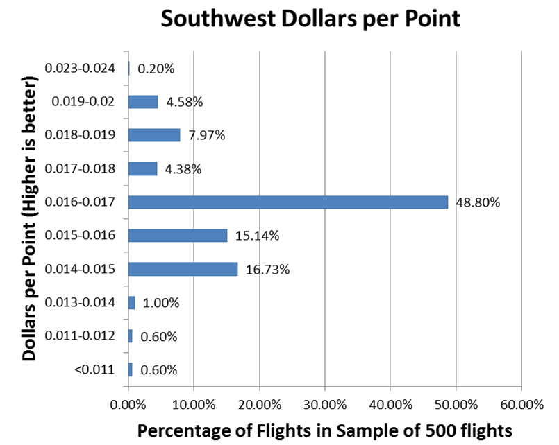
Looking at the the dollar per point values, only 2.2% of flights fall below the 1.4 cents ($0.0143) rate.  16.73% fall right around the advertised rate.  A tremendous 81.07% offer a better dollar to point conversion that advertised.

southwest-points-per-dollar

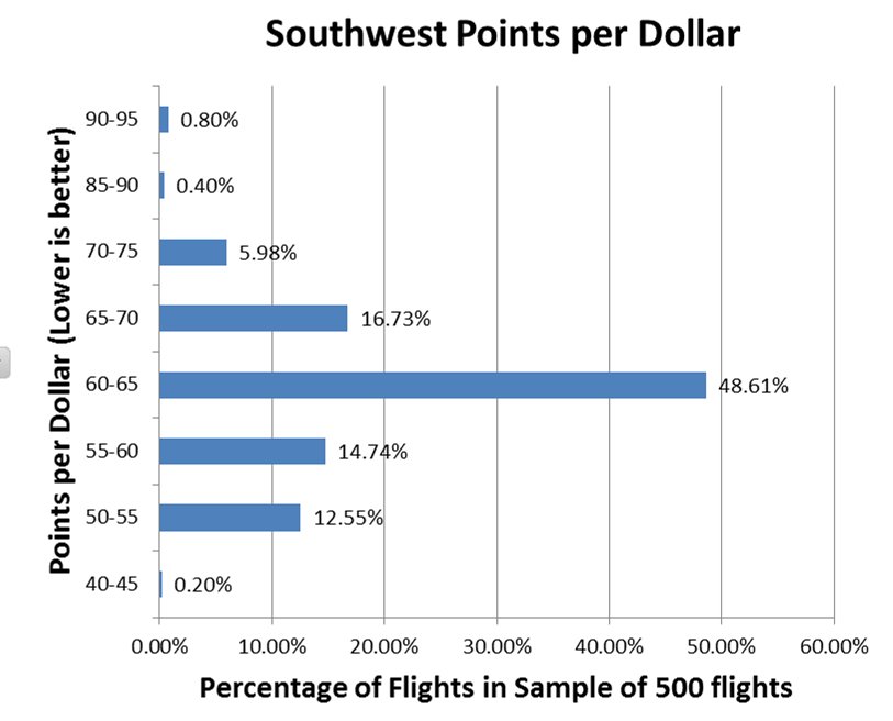
Looking  at the data by points per dollar gives a similar graph.  The categories are slightly different than the dollar based one, which is why the distributions are slightly different.

Methodology

To get these numbers, I took the price of a flight in dollars and compared it to the price of the same flight in points.  I adjusted the prices for the $5.60 fee per flight that is charged for any reward flights. For reference, here are some other point valuations.  The numbers may vary because of the flights they checked and dates of those flights:

  • NerdWallet : $0.011 dollars per point; 90.9 points per dollar
  • The Points Guy : $0.015 dollars per point; 66.7 points per dollar

On the eve of the election: Trump vs Clinton Spending

It’s the night before the 2016 election, and I’m having trouble focusing on the next day.  I’ve channeled my sleeplessness into creating this graph to compare Donald Trump and Hillary Clinton’s campaign spending by week.  The data goes up thru the last reported FEC update of October 19.

Overall Clinton reported spending $464 million dollars compared to Trump’s $251 million.  The majority of this disparity came from early in the campaign season when Trump had not yet won over the Republican National Committee.  In the graph, Trump’s spending roughly matches Clinton’s towards the most recent weeks.

Election Spending Thoughts

  • Donald has only been able to outspend Hillary a handful of weeks during the election season.
  • The week of 10/15/2016 is a partial week that cuts off spending on the 19th.
  • There are 6 times where one of the candidates spent more than $20 million in one week. 4 times for Trump. 2 times for Clinton.  That is an insane amount of money.
  • The raw data is from here: Clinton’s Data,  Trump’s Data

vote_today

Update: Trump won, read more on DaiDaDo about his promises.

Explore Net Worth Rankings by Age (25th to 75th Percentiles)

Net worth increases from the 18 -25 age bracket up thru the 66-75 age bracket right around when retirement begins for most people.  In order to be at the 75th percentile in wealth in the 66-75 age bracket, you would need to save roughly $12,000 a year every year since you were 18. After hitting retirement age, net worth for the 25th, 50th and 75th percentiles decline rapidly. The gap between those at the 75th percentile grows to it’s largest at for the 66-75 age group.

Explore the graph, below to see the results visually. Click the graph to expand:

How much do you have to save per year to be in one of those groups?

Age Bracket 25% 50% 75%
18 -25  $      (737)  $            1,314  $    4,714
26 – 35  $          80  $            1,384  $    6,594
36 -45  $        253  $            2,124  $    9,857
46 – 55  $        379  $            3,374  $  12,472
56 – 65  $        760  $            4,162  $  13,459
66 -75  $    1,334  $            4,290  $  12,686
76 – 85  $    1,139  $            3,219  $    6,978
86 – 100  $        767  $            2,062  $    4,647

For example, if you are in the 26-35 age bracket at age 30 and wanted to be in the 75th percentile in wealth, you would need to have saved $6,500 per year since you were 18.

What is a percentile

Percentiles are basically rankings, so that we can do comparisons of different kinds of data. For example, if there were 100 people in the age bracket, the 25 richest people would be in the 75th to 100th percentiles.  The next 25 people by wealth would be in the 50th to 75th percentiles. These people would be above average in wealth, since the person at the 50th percentile is the median (average) wealth. After that the next 25 people would be below the median (average) in wealth at the 25th to 50th percentiles. Finally, the poorest 25 people would be in the 1st to 25th percentiles.

How to read the graph

The light green region represents the net worth’s of people in the 50th – 75th percentiles for each age bracket, who are above average in wealth. The darker green shaded region represents the net worth’s of people in the 25th to 50th percentiles. For each age bracket, there is a label at the 25th, 50th, and 75th marks to label the net worth of people at that age and net worth ranking.

What does this tell us?

For younger Americans, wealth inequality is relatively minor. Those at the 75th percentile for ages 18-25 only have $12,000 more in wealth on average than the median person. This is probably because most of the people in this group are early in their careers, so they haven’t had much time to build up wealth. Across most age brackets, the gap between someone at the 25th percentile compared to the median (50th percentile) is much smaller than the gap between the median and the 75th percentile. This tells us that wealth is concentrated more heavily in the wealthy rather than being more equally distributed. To put that in perspective, the jump to move from the 50th to 51st percentile is larger in dollars than the drop to go from the 50th to 49th.

Unfortunately, this inequality where wealth is unevenly concentrated in the higher percentiles increases with age. It peaks right around when most Americans begin to retire.

Play with the data yourself on the Net Worth Percentile Calculator.  The original data is from the Federal Reserve’s Survey of Consumer Finances.

Change in Manufacturing Jobs by County 1975-2015 [USA]

Watch 40 years of change in manufacturing jobs across the United States from 1975 to 2015. The colors are based on the number of manufacturing jobs in each county as measured by the Bureau of Labor Statistic’s Labor Estimates. Each year (1985, 1995, 2005, and 2015) are compared to 1975 to calculate the percentage change. Green counties have gains in manufacturing jobs.  Red counties have losses.  Counties that are gray have little to no change.

Overall, these 15 counties have seen the largest losses.  Most of these counties were former industrial powerhouses who had distinct advantages in transportation, infrastructure, and energy availability. Those advantages have been rendered obsolete.  Rapid automation and infrastructure improvements in transportation, energy, and communications across the rest of nation have enabled production to spread across the United States as well as overseas.

Top 15 Counties by Largest Losses in Manufacturing Jobs

County 2015 1975 Net Loss
Cook County, Illinois 186,967 666,136 -479,169
Los Angeles County, California 357,554 777,465 -419,911
New York County, New York 27,098 293,745 -266,647
Wayne County, Michigan 88,578 325,077 -236,499
Cuyahoga County, Ohio 69,812 224,160 -154,348
Philadelphia County, Pennsylvania 21,473 164,885 -143,412
Allegheny County, Pennsylvania 36,150 159,353 -123,203
Milwaukee County, Wisconsin 52,495 154,937 -102,442
Kings County, New York 21,174 119,640 -98,466
Hamilton County, Ohio 48,357 134,527 -86,170
Monroe County, New York 40,872 125,510 -84,638
St. Louis City Missouri 17,871 194,998 -77,127
Fairfield County, Connecticut 33,938 108,405 -74,467
Bergen County, New Jersey 30,947 103,631 -72,684
Essex County, New Jersey 16,990 89,462 -72,472

Almost all of these counties are located in the Rust Belt with the exclusion of Los Angeles, County.  Although many of these counties have successfully shifted to new industries in tech and finance, others such as Wayne County have been struggling.

On the other side, counties which have seen the largest increases have not seen increases as large as the decreases in the top 15 counties. Cook County alone had 666k manufacturing jobs in 1975 compared to these counties which had 927k manufacturing job combined in 2015.

Top 15 Counties by Largest Gains in Manufacturing Jobs

County 2015 1975 Net Change
Maricopa County, Arizona 115,385 71,973 43,412
Snohomish County, Washington 63,537 20,588 42,949
San Diego County, California 104,092 71,087 33,005
Elkhart County, Indiana 60,478 31,269 29,209
Harris County, Texas 189,946 161,511 28,435
Washington County, Oregon 47,167 19,747 27,420
Travis County, Texas 40,252 14,568 25,684
Riverside County, California 41,210 18,907 22,303
Ottawa County, Michigan 38,358 17,732 20,626
San Bernardino County, California 53,485 32,871 20,614
Collin County, Texas 23,618 3,705 19,913
Rutherford County, Tennessee 25,301 5,989 19,312
Waukesha County, Wisconsin 43,850 24,896 18,954
Gwinnett County, Georgia 25,246 6,328 18,918
DuPage County, Illinois 55,273 36,416 18,857

Note: Some counties have been excluded from the summary tables due to missing data on some of the reported years.

Historical Chicago Single Family Home Prices (1970-1986)

I was recently exploring some of Robert Shiller’s online data and noticed that he had some historical housing data on Chicago from the 1970s and 1980s.  I was curious what the data looked like after adjusting it for inflation and comparing it to more recent housing prices. Conventional wisdom says that home ownership is one of the best investments that can be made.  This is because it is an investment that you can use on a daily basis on top of being  an asset that could potentially appreciate in value over time.

After adjusting the historical median home prices, median single family home prices were generally between $170,000-200,000 for the 16 year period that Shiller researched (see table below).  According the Chicago Tribune, in early 2016, Chicago single family home prices were roughly $223,000. Taking the inflation adjusted numbers compared to the current housing values, this equals a 0.5% to 1.0% annual inflation adjusted growth rate to property values of single family homes in the city of Chicago, which is in line with previous estimates of home appreciation in the US.

As you can see in the table of the results, the nominal home prices have increased greatly over the past few decades, but the rate of growth over inflation is much smaller than you would have thought given conventional wisdom.

Year  Home Price Nominal Inflation Adjusted (2015) Inflation Adjusted Growth Rate
1970 $29,000.00 $178,930.00 0.489%
1971 $31,000.00 $183,210.00 0.447%
1972 $31,000.00 $177,320.00 0.533%
1973 $34,000.00 $183,260.00 0.467%
1974 $39,000.00 $189,540.00 0.397%
1975 $42,000.00 $186,900.00 0.441%
1976 $44,000.00 $185,240.00 0.476%
1977 $47,500.00 $187,625.00 0.455%
1978 $55,000.00 $201,850.00 0.269%
1979 $62,000.00 $203,980.00 0.248%
1980 $70,000.00 $203,000.00 0.268%
1981 $68,500.00 $180,155.00 0.628%
1982 $73,000.00 $181,040.00 0.632%
1983 $69,900.00 $167,760.00 0.889%
1984 $61,500.00 $141,450.00 1.468%
1985 $74,000.00 $164,280.00 1.019%
1986 $78,500.00 $171,130.00 0.913%


Historical Chicago Home Prices Adjusted to 2015 Inflation

The raw housing data is available on Shiller’s website, and data for Dallas and Atlanta are also available.  The inflation data is from Westegg.