Are New Grad Law Salaries Actually Bi-modal?

It’s a common refrain that law salaries for new grads are bi-modal, with a large percentage of law graduates going into Big Law. The NALP even publishes data that shows a double humped distribution of salaries every year. But a quick query of freely available American Communities Survey data (collected by the US Government) shows that there is a small hump in the same spot that the NALP survey reports. But NALP shows nearly 21% of graduates with income around $185k / year and it looks like roughly 26%+ are earning at least $160k which looks to be a huge overstatement. This is what I found:

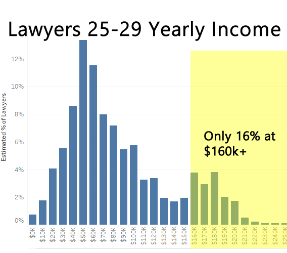
Only 16% Reported Income Near that Range

  • Mean : $91,798 / year
  • Median : $75,000 / year
  • 25th Percentile : $51,771 / year
  • 75th Percentile : $119,976 / year

I have read comments questioning some of the data collection methods that NALP uses, and I think that this single slice of data definitely shows that there is an odd deviation from the results I derived from the ACS. If anything my data should skew higher, because I could not separate people with only 1 year of experience out. So there would be associates with in Big Law with multiple years of raises and experience in this data set. An interesting overlap is that the NALP’s adjusted mean is slightly below the mean salary that I have calculated, which is interesting as to how close it is.

Methodology

  • ACS 5 Year 2013-2017 Micro-data
  • Industry : Legal services so this would be limited to law firms specifically.
  • Ages 25-28 to try to capture new grads specifically with at least one year of work, there was no way to restrict years of experience.
  • Occupation : Lawyers, and judges, magistrates, and other judicial workers (This was the lowest level, I could separate it at, but I doubt there are a lot of Judges/Magistrates/Other in this age range)
  • Education: Professional degree beyond a bachelor’s degree (Could not be more specific)
  • Weeks worked prior year: >40+ weeks / year (to try to exclude people who were reporting income from partial year internships/clerkships)
  • Hours Worked in a usual Week : >35+ hours / week (to try to get only full time)
  • Currently Employed

Cities with largest cost differences for Home-owners with Mortgages vs without

Here are the top 20 metro areas with the largest nominal gaps between the median monthly cost of home owners with mortgages versus home owners with out mortgages.

Median Costs by Metro Area

  • Dark Blue is Median costs of Home-owners without Mortgages.
  • Light Blue is Median costs of Home-owners with Mortgages.
  • Dark Line is Median costs of ALL Home-owners.
  • Grey $ Amount is the difference between a median Home-owner with a mortgage versus one without.
  • Hover over or click the bars and lines for a tooltip.

Nationally the median monthly costs are $1,516 (with) versus $474 (without) or a 3.19 ratio. But for the cities at the top of this ranking, the ratio is much higher at 4.35. It seems in SF/SJ if you bought property a long time ago it’s very cheap to hold onto, compared to someone buying more recently with debt.

Californian cities rank very prominently on the list, and this may be due to their laws with restrict property tax increases to long-time home owners, who are also the same people who are most likely to have no-mortgages. I did a quick check of who these people are for the San Francisco Metro area, and the median age of a home owner with no mortgage is 67–practically retired. The median age of a home owner with a mortgage is a bit lower at 52. Comparably expensive areas like NYC and Connecticut have smaller cost gaps between home-owners of different mortgage statuses.

I had originally built this list on the ratio of the costs of HO with mortgages vs HO without, and the chart was pretty much all Californian and Coloradan cities.

Want to see more cities?

If you are interested in more city level information, you can find this data on the City Housing Cost Percentile page. It shows a distribution for home-owners by mortgage status, renters, and the overall housing cost distributions by metro area. The national variation is listed on the National Housing Cost Percentile page. The percentiles at the upper end of the distributions are most likely under-estimates, but that was the data that was available to me

Methodology and Calculations

The data is based on the microdata previously mentioned for each metro area. These results are based on microdata from the 2013-2017 American Community Survey. Housing costs include mortgages, utilities, monthly fees like HOA’s, insurance and property taxes; this is to match the Selected Monthly Owner Costs metric that the ACS publishes. This was calculated in R and exported for these graphs. Utilities are included because some homes roll those costs into different buckets (e.g. HOA), so it is more of an apples to apples comparison to include utilities and all normal fees related directly to the home.

If you would like to compare the results by metro area, you can go to the American Fact Finder tool and select specific geographies to compare the results. There may be small variances between the ones reported and the ones I calculated. These variations may be due to the function in R that did the weighted median / percentile groupings as well as data that was not released publicly by the ACS. In the example to the right for the top 3 cities, the comparison to the FactFinder had almost the same numbers, so I am fairly confident that the remainder of the results should be representative. The All Home-owner metric is not available as a pre-calculated number to check against. But, because the other 2 numbers we can verify are good, most likely these are relatively close as well.

New name, and new calculators coming soon!

I’ve decided to retire the old Shnugi name after 15 years of using this to host my data analysis tools. Although I will continue to use it as my username. I don’t know if I’ve gotten all the links updated, but it seems like everything is working after the migration. Please let me know if you find any broken images, links or pages.

I haven’t really been doing a lot of personal blogging, and I thought it would be more fitting to have a more descriptive name, since most people aren’t here to read about me but to find out things about themselves.

New calculator

The newest calculator is a housing percentile to compare your housing costs nationally. Make sure to include your utility costs and fixed fees like HOA.

Calculate how much can you save with pre-tax commuter benefits for 2020

Marginal Tax Bracket
Select the appropriate marginal tax rate matches your income. For example if on your taxes you report $100k in adjusted gross income (AGI) as a single filer, pick the 24% option, because you make at least $84k but less than $160k.


Monthly Commuter Contribution ($270 max/month)


How does this work?

The Pre-Tax commuter benefit works exempts up to $270 per month from Federal income, Social Security, and Medicare taxes. This money can only be spent on eligible travel to work expenses such as public transit passes (commuter trains/buses/vanpool), parking at your employer, or ride-share (Uber Pool/Lyft Line). In general, your employer will partner with another company who will provide the passes and payment cards. This has been increased from $265 per month from 2019.

So imagine that if you earn $70,000 a year in Texas, and pay $200 per month in eligible parking fees at your workplace:

Before Pre-Tax Benefit

  • Monthly Income: $5,833
  • Taxable Income: $5,833
  • Total Federal Taxes: $1,238
  • Parking Pass Using Your Credit Card : $200
  • Amount left over : $4,395

After Pre-Tax Benefit

  • Monthly Income: $ 5,833
  • Parking Pass Using Pre-Tax Commuter Benefit: $200
  • Taxable Income: $5,633
  • Total Federal Taxes: $ 1,194
  • Amount left over : $4,439

Savings of $44 / month or $528 / year!

Sure this isn’t a ton of money. But if you’re already auto-paying for public transit passes, ride share (Uber, Lyft), or parking every month to get to work, this is a quick an easy way to save some money with minimal effort. The only downside is that you employer must have an account set up with a benefits provider to allow you to take the deduction.

This calculator is for illustration only, and the tax brackets and contribution limits will likely shift in coming years. Some states will also deduct Pre-Tax Commuter benefits from their state and local taxes so your savings could be even bigger! If your income is right at the border of the break point of one of the marginal tax brackets, your actual savings will vary a little bit. Just something to keep in mind. For more information, the IRS has a very long PDF with all the details
https://www.irs.gov/pub/irs-pdf/p15b.pdf .

One weird thing about the benefit is that your employer may or may not list the benefit in Box 14 of your W2. So I’m not sure how the government tracks how compliant you are with you spending or contributions or if there’s a difference if you have multiple jobs. It seems like there’s a lot of trust in the companies that administer the benefit to do it correctly.

Household Savings Improves to only 36% Spending more than Income

After analyzing data from the 2017 Consumer Expenditures Survey (CEX) by the Bureau of Labor Statistics (BLS), nearly 35.9% of US households spent more than they earned. This is the most recently available data from the BLS. Overall, 46 million out of 129 million US households are estimated to have had expenditures that exceeded their after tax income (table below).

Large Improvements since 2015

Comparing these results to the previously reported ones for 2015’s CEX survey where I reported 38.5% spending more than income, the percentage American households saving has improved significantly. Almost 2.5 million fewer households are spending more than they earn, which is a huge improvement. In addition households tended to save more than in 2015, as the $0-$10k group dropped by 1.4 million households, with large increases in households saving larger amounts of income. One of the largest shifts appears in the decline of household who spent more than $150k than they earned. Shockingly, this category decreased 54%! I suspect that the losses of this size were primarily due to investments and housing losses, and values for both of those assets have increased significantly in the past few years.

Continue reading Household Savings Improves to only 36% Spending more than Income