Validating the Net Worth Percentile Calculator

With all the recent discussion on fake news. I want to take some time to go over some basic fact checking. Recently, it came to my attention that a certain website was publishing a number that said the average millennial had a negative net worth–this is false by the way. The author crudely extrapolated off of a handful of data points from the SCF and a WSJ article.

My Net Worth Percentile Calculator as well as the others all run off of the publicly available micro-data from the Federal Reserve’s Survey of Consumer Finances or Bureau of Labor Statistic’s Consumer Expenditure. I take great care to ensure that the results of the calculators would meet the same standards as the work I do in my day job as an analyst.

Comparison to Published SCF Stats

Here, are side by side comparisons from the Survey of Consumer Finances. I am using this Changes in U.S. Family Finances from 2010 to 2013: Evidence from the Survey of Consumer Finances to do the comparisons.

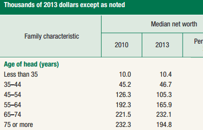
On page 12 these are the value’s calculated for median net worth by age from the SCF:
Click on the links to open the net worth percentile calculator for that age range.

Age Median Net Worth 2013
Less than 35  $                                 10,460
35-44  $                                 47,050
45-54  $                              105,600
55-64  $                              169,640
65-74  $                              229,800
Greater than 75  $                              194,700

As you can see, the totals from the calculator track very closely with the published statistics from the US Treasury.  The numbers do not match exactly, probably due to some differences in clean up that the US Treasury does for their official numbers versus what I do with the the raw data that they publish.

Charting Income Distributions of Rodan + Fields and It Works!

I’ve had a rash of co-workers and Facebook friends posting about MLM’s like Rodan and Fields, Nerium, and It Works! So, I’ve been reading Lazy Man and Money’s blog posts about MLM’s, and decided to chart their self reported income disclosures visually. Visually looking at a graph can be very different than looking at a table of the same data.

MLM Income Disclosures

Each MLM must publish income disclosures to be compliant with governmental FTC regulations. These disclosures can tell you how much people are earning at each level of the company. For example, the top level at Rodan and Fields is the RFx Executive Consultant. According to Rodan and Field’s discolsures, 0.1% of all active distributors are at that level. That translates to one in a thousand distributors is an RFx Executive Consultant. The average annual earnings for the top 1 out of a 1,000 consultants was $661,474 in 2015.

In the charts below, are the distributor levels for R + F and It Works! with the percentage of distributors who in each level with their average earnings next to it.

Rodan + Field 2015 Income Distribution

Source: Rodan and Fields 2015 Income Disclosure

It Works! 2015 Income Distribution

Note: The It Works! disclosure is reported in monthly values, whereas the previously mentioned R + F values were reported as annualized values.

Source: It Works! 2015 Income Disclosure

A special thanks to Jason Davies for posting his example of a D3 stacked population chart that I modified for this.

How much of the US could the top 1% buy?

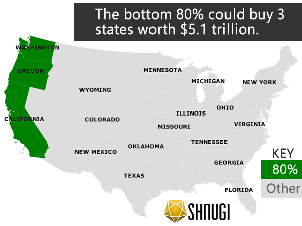
If the top 1% of the nation put all of their money into land they would own 40 states.  In contrast the bottom 80% of the nation could only afford to own all the real estate in 3 states.  All the real estate in the contiguous US is estimated to be worth nearly $23 trillion. The top 1% of US households is estimated to be worth $19.2 trillion.  This means that only 1% of the US population could literally afford to buy almost the entire country if it were for sale.

These numbers are based on the top 1% by net worth, instead of income.  Sources and tables are at the bottom of the page.  If you’re curious how close you are to the top 1%, try out the net worth percentile calculator or the income percentile calculator.  They are based on a different data set, but the general trends are the same.

I filled in the maps starting in the west coast and moved east.  I removed states that the 1% couldn’t afford in their $19.2 trillion budget starting with Florida. The 8 states in the contiguous US that weren’t selected are Tennessee, West Virginia, Virginia, North Carolina, South Carolina, Georgia, Alabama, and Florida.

The bottom 80% had a combined wealth of $5.1 trillion, which could pay for California, Oregon, and Washington. I wanted to stay consistent and start from the west coast, so California just based on it’s size and wealth is driving down the number of states.
Continue reading How much of the US could the top 1% buy?

Top American Cities to launch a Financial Career

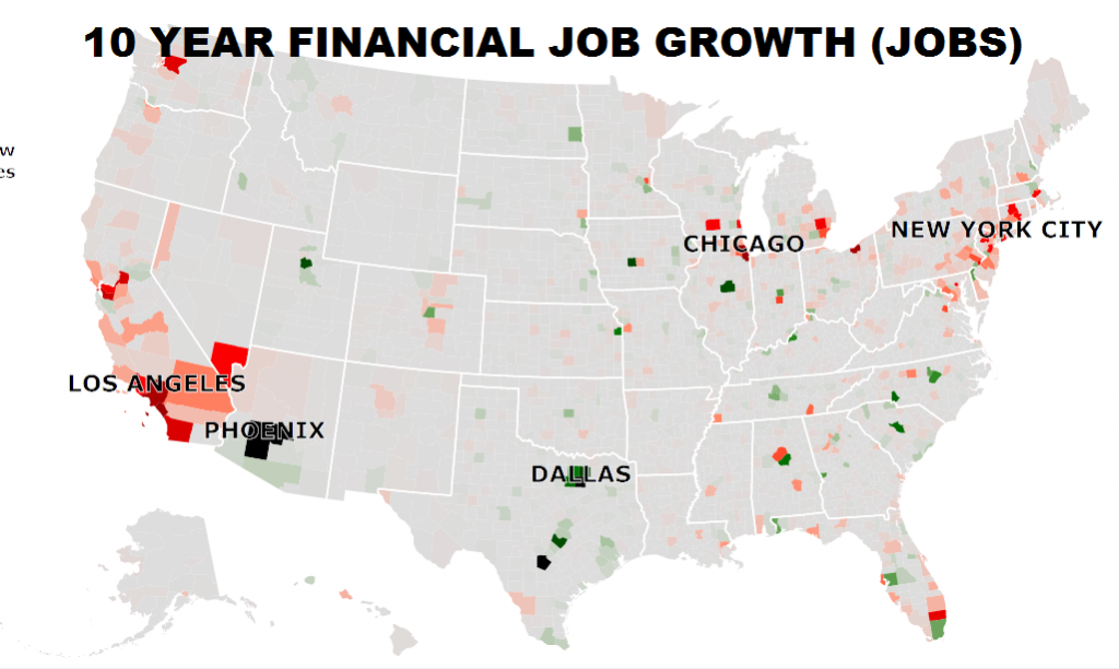
Finance is one industry that is very strong across most American cities with many job options that pay extremely well compared to median salaries. Read more to find out about the cities with the largest job markets and the fastest growing job markets. Also explore the county by county data in the interactive map at the bottom, where you can explore the regional differences in job growth rates, raises, income, and number of people employed in companies in the financial sector.

Top 5 Cities by Total Number of People Employed in Finance

 City Employed in Finance 2015
NYC (5 boroughs) 324854
Chicago (Cook County) 146597
Los Angeles (LA County) 133268
Phoenix (Maricopa County) 122541
Dallas (Dallas County) 117263

These cities generally align with the major financial areas that you typically think of for finance. NYC has Wall Street. Chicago has commodities and is the heart of trade for the center of the country. Los Angeles, Phoenix, and Dallas are corporate centers with many financial companies supporting. While these cities currently have the most jobs, they aren’t all growing. So these cities might have healthy financial sectors today, in the future other cities lower in the list may grow past them.  Many of the cities in the top 5 such as Chicago and Los Angeles have seen substantial drops in financial sector employment over the past 10 years. Keep reading to find out where the up and coming cities are.

Financial sector jobs have seen declines in many major areas.

Top 5 with Growing Finance Sectors

Texas dominates the counties with the largest nominal increases in employment in the financial sector with 3 of the top 5 counties with job growth over the past 10 years. With greater job growth comes greater opportunity to move companies for increased pay and responsibilities that you might not be able to get in more stagnant markets.

City 10 Year Growth in Employment
Dallas (Dallas County, Texas) 14740
Phoenix (Maricopa County, Arizona) 14671
San Antonio (Bexar County, Texas) 14558
North Dallas Suburbs (Collin County, Texas) 8265
Des Moines (Dallas County, Iowa) 7900

Top 10 Counties by Growth Rate

While Texas dominates the raw growth by number of jobs, the fastest growing counties by annual % job growth are spread all over the country in smaller cities. It may be good to launch your career in a smaller market that is growing fast. Sometimes it’s better to be a big fish in a small but growing pond than a big fish in a large shrinking pond.

City Annual Increase % (10 yr avg)
Des Moines (Dallas County, Iowa) 10.08
Denton (Denton County, Texas) 8.71
Birmingham (Shelby County, Alabama 8.36
Bloomington (McLean County, Illinois) 5.2
Columbia (Richland County, South Carolina) 3.9
North Dallas Suburbs (Collin County, Texas) 3.3
Austin (Travis County, Texas) 2.95
San Antonio (Bexar County, Texas) 2.82
Kansas City (Johnson County, Kansas) 2.26
Salt Lake City (Salt Lake County, Utah) 1.93


Interactive map after the jump.

Continue reading Top American Cities to launch a Financial Career

Possible changes to Scottrade after the merger to TD Ameritrade

A month ago TD Ameritrade and Scottrade agreed to merge for $4 billion. In this merger TD Ameritrade will be buying Scottrade, and they expect to see $450 million in benefit by merging.  That $450 million will be realized through cost cutting and revenue growth.

What could this mean for you, if you have a Scottrade account?

TD Ameritrade generally has higher rates than Scottrade by as much as 43% (see below for transaction pricing differences).   Most likely after the merger Scottrade’s pricing will be increased to match TD Ameritrade.  This means that those price increases will be passed on to you to help the company “earn” the benefit from merging.  In addition, if there are TD Ameritrade branches that are nearby Scottrade branches, the merged company will most likely close one of those branches.  Read through the comparison of pricing to see if the cost differences could impact you.  If the differences are substantial for the types of trades that you do, you may want to consider moving your accounts to other brokerages.

Scottrade Pricing vs TD Ameritrade Pricing

Scottrade and TD Ameritrade do not charge inactivity fees or minimum monthly transaction fees.  So at minimum after the merger, nothing should change there.

Stocks and ETF Trades

Scottrade TD Ameritrade Difference
Online $7 $9.99 +43%
Broker $32 $44.99 +41%
Phone (IVR) $32 $34.99 +9%

One benefit that TD Ameritrade has is that they offer a wide array of around 100 ETF’s that you can trade for free.  Scottrade used to have a handful of no trading fee ETF’s but that program was discontinued.

Mutual Funds

Scottrade TD Ameritrade Difference
No Load, No Transaction Fee (NTF) $0 $0 0%
No Load $17 to sell $49.99 to sell 194%
Load $32 to sell $0 to sell -100%


Options and Contracts

Scottrade TD Ameritrade Difference
Online $7 + $0.70 per contract $9.99 + $0.70 per contract +43%
Broker $32 + $0.70 per contract $44.99 + $0.70 per contract +41%
Phone (IVR) $32 + $0.70 per contract $34.99 + $0.70 per contract +9%
Option Exercises Assignments $17 $19.99 +18%


The merger has not yet been approved by the FTC, but is it likely to be approved as there are other competing brokerages that would be larger than the combined company.