Now that I’ve updated all the tools to reflect 2013 SCF data, I decided to create a much larger database from the SCF using data all the way back to 1989. There’s more to come on that, as I am still working on the best way to let you guys play with the data, but just to show you what’s to come. Like the tools that are currently available, this data was calculated using the Federal Reserve’s Survey of Consumer Finances. I took the net worth statistics for each year and calculated what it would take to rank at certain percentiles of wealth.
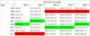
Here is a table showing the net worth by percentile for every SCF since 1989. The Fed has already converted all the dollar values in the most recent versions of the data to 2013 dollars (using standard inflation rates), so we’re comparing apples to apples. As you can see across the board, from 2004 to 2007, net worth peaked across the distribution.  The disturbing thing though, is that since then only the 90% and above has had a nearly full recovery in wealth. The 25% and below are hitting historic lows in wealth, and the median wealth of Americans is lower than 1989, despite the massive increase in GDP, productivity, and total wealth in the United States. It appears that the majority of those gains have been concentrated in the top 10% of Americans rather than being evenly distributed.
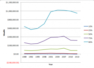
 For further reference here are those same numbers plotted to show the relative changes in wealth between Americans at the 10th, 25th, 50th, 75, and 90th percentiles. The largest gains in the last couple decades have captured at the 10% and presumably above. I am hesitant to calculate and publish the numbers of the 5th and 95th percentiles because the data is a lot more prone to being skewed at the long tail ends of the distributions.
