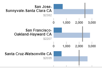
Here are the top 20 metro areas with the largest nominal gaps between the median monthly cost of home owners with mortgages versus home owners with out mortgages.
Median Costs by Metro Area
- Dark Blue is Median costs of Home-owners without Mortgages.
- Light Blue is Median costs of Home-owners with Mortgages.
- Dark Line is Median costs of ALL Home-owners.
- Grey $ Amount is the difference between a median Home-owner with a mortgage versus one without.
- Hover over or click the bars and lines for a tooltip.
Nationally the median monthly costs are $1,516 (with) versus $474 (without) or a 3.19 ratio. But for the cities at the top of this ranking, the ratio is much higher at 4.35. It seems in SF/SJ if you bought property a long time ago it’s very cheap to hold onto, compared to someone buying more recently with debt.
Californian cities rank very prominently on the list, and this may be due to their laws with restrict property tax increases to long-time home owners, who are also the same people who are most likely to have no-mortgages. I did a quick check of who these people are for the San Francisco Metro area, and the median age of a home owner with no mortgage is 67–practically retired. The median age of a home owner with a mortgage is a bit lower at 52. Comparably expensive areas like NYC and Connecticut have smaller cost gaps between home-owners of different mortgage statuses.
I had originally built this list on the ratio of the costs of HO with mortgages vs HO without, and the chart was pretty much all Californian and Coloradan cities.
Want to see more cities?
If you are interested in more city level information, you can find this data on the City Housing Cost Percentile page. It shows a distribution for home-owners by mortgage status, renters, and the overall housing cost distributions by metro area. The national variation is listed on the National Housing Cost Percentile page. The percentiles at the upper end of the distributions are most likely under-estimates, but that was the data that was available to me
Methodology and Calculations
The data is based on the microdata previously mentioned for each metro area. These results are based on microdata from the 2013-2017 American Community Survey. Housing costs include mortgages, utilities, monthly fees like HOA’s, insurance and property taxes; this is to match the Selected Monthly Owner Costs metric that the ACS publishes. This was calculated in R and exported for these graphs. Utilities are included because some homes roll those costs into different buckets (e.g. HOA), so it is more of an apples to apples comparison to include utilities and all normal fees related directly to the home.

If you would like to compare the results by metro area, you can go to the American Fact Finder tool and select specific geographies to compare the results. There may be small variances between the ones reported and the ones I calculated. These variations may be due to the function in R that did the weighted median / percentile groupings as well as data that was not released publicly by the ACS. In the example to the right for the top 3 cities, the comparison to the FactFinder had almost the same numbers, so I am fairly confident that the remainder of the results should be representative. The All Home-owner metric is not available as a pre-calculated number to check against. But, because the other 2 numbers we can verify are good, most likely these are relatively close as well.

Wow california is ridiculous!